Evolution of the Hummingbird
Flying Home
by
Paul and Kristie Rogers
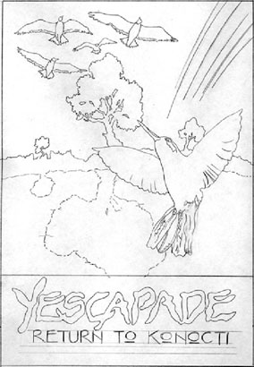
This year we were once again graced with the artwork of our friends from Down Under, Paul and Kristie Rogers. Residing in Auckland, New Zealand, their work involves Graphic Art and Design, uitilizing both traditional and computer graphics techniques. The integrated styles lend an otherworldly effect, whilst still maintaining a firm foot on the ground. This page will walk you through the various stages of the graphics development process, which we thought you might find interesting.
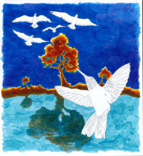
| The image was created in May/ June 2002,
after we had come to the conclusion
that
a Yescapade was inevitable. After some
discussion,
Paul and Kristie went off and created
the
groundwork for the image, with Paul
producing
a pencil drawing for our input. The
idea
was to symbolize Rick Wakeman rejoining
the
other four Yes members, while also
retaining
a connection to last years event. As
a result,
Paul chose a particularly compelling
photograph
of a hummingbird to represent Rick
flying
up to meet the other four birds, flying
in
formation overhead. The Yescapade itself
is represented by the tree, reflecting
in
the waters of Clear Lake. The original
image
was intended to have lightning effects
as
well as a rainbow representing the
"Light".
Photo reference of Hummingbird Copyright Gregory J. Scott and Ralph W. Scott. Used by permission. |
 |
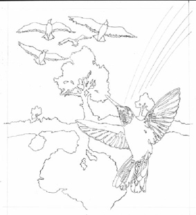 |
The pencil roughs were refined through a few more stages so that Paul could really tighten the composition and arrangement of the various elements. This was then developed into an outline guide for the coloration which followed. |
| The next step was to start adding color. Paul blocked in an acrylic base to begin playing off areas of color emphasis. He graduated a dark violet through the dark blue sky to try to compensate with sufficient darkening for the colors and structures he intended to use for the lightning and rainbow effects in later stages. | 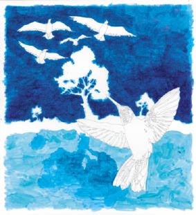 |
 |
The addition of the reds and yellows to the mid-ground land mass and trees adds electricity to the painting. The unusual tinges and deepening reflections break the boundaries of our images of the world around us. |
| Now the birds in the image begin to take on a life of their own. The initial image still envisions a dark, gathering dusk feel to it. As the creative process unfolds, this look and feel will change slightly as weights and balances within the picture plane are adjusted to place specific emphasis. |  |
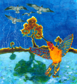 |
Paul's comments: "I wanted to combine watercolour style illustration (background sky) with a more painterly illustrative midground. Half of the image, ie the lower half, is impressionistic and contrasts with a flat colour graphic style (foreground bird). Whilst the image is somewhat traditional (a compromise to necessity) I felt I'd put more design into the narrative created by the juxtaposition of elements. I guess this is me being post-modern in choosing to sample styles and references and then combining them into a new order (deconstruction) whilst still managing to pay homage to the past established visual style of Yes' releases. A tricky juggling act." |
| At this point, we decided that the birds in flight needed more color and Paul added interesting symbols and brilliant colors. The overall colorations of these birds were inspired by the brilliant colors of tropical birds, while retaining some of the characteristics of more temperate birds. | 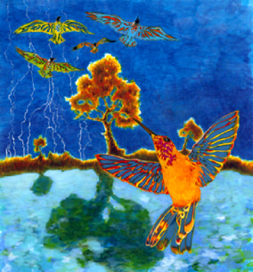 |
 |
Paul had this to say about the final painting: "My favorite part of the whole image is the tree which has grounded itself within a new landscape since last years poster. That's my symbol for Yescapade btw. The shadow version is also very interesting in its blurry treatment." |
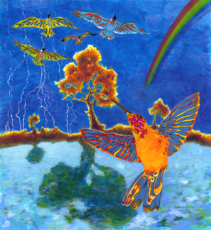
| Of course, as artists as wont to do, Paul
and Kristie decided to change directions
as they prepared the full posterized version
of the art. They decided the sky was too
busy and sent this rather different picture.
Paul: "Having both lightning _and_ a
rainbow in the sky presented a few colour
choice dilemmas in respect to how the sky
was going to end up. A few late night headaches
actually. Digitally clear cutting the sky
and vignetting it down at the horizon satisfied
all requirements. Even though I liked the
lightning and rainbow I started to get the
feeling that the overall image was too cluttered
so I had no qualms about removing those elements
in the end. As a result the final poster
is both aesthetically pleasing and does the
job its intended to do ie it supplies a visual
brand and identity to this unique event.
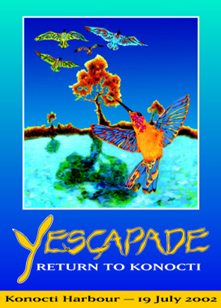
Have a great day" We had grown accustomed to the other sky image, but saw that there was a difference in the mood of the picture. The new art evoked a more peaceful and calming image as compared to the stormy and intense painting. While we liked the painting a lot, the poster art, with the smooth, calm sky won us over. This is the image you will see used on posters, the table art and at various locations around the venue, as well as the postcards. |
|
 |
The solo image of the hummingbird is very compelling and has been made the subject of the event tickets and tee shirt images. We immediately fell in love with this bird image, and are happy to have such a distinctive image associated with our event. Paul and Kristie have really outdone themselves this year, and we all want to thank them and give them a hearty "Ta!!" |
Artist Biographies
 |
 |
|
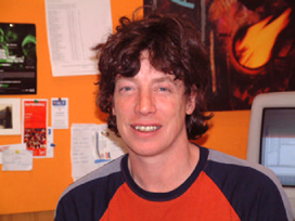
Paul Rogers Paul was born in Dewsbury, England in 1959. His family emigrated to Auckland New Zealand in 1975 where, after high school, Paul was given the opportunity to attend Auckland University studying a Bachelors degree in Science majoring in Astrophysics (1978-79). After several years working in consumer electronics Paul shifted his interests and studied preliminary Art in various Polytechnic night classes. He then enrolled full time in a Diploma of Graphic Design and upon graduation in 1990 became employed by the School of Art and Design (Auckland University of Technology) as a Graphic Design Technician. For the past twelve years Paul has continued to work for the school while also managing to juggle freelance illustration and Design work; a passion for local Comic Art production; part time teaching; completing a Bachelors Degree in Graphic Design (1999-2000) and, most importantly, Parenthood. Paul has a studio at home where he tries to squeeze in as many extra projects as possible including paintings for Gallery shows and a recent new interest in Live Concert photography. In his spare time Paul plays soccer, collects American superhero Comics and also collects live Yes recordings as well as contributing to numerous online Yes discussion forums as nzyesfan. In the future, Paul and Kristie would like to further their collaborative efforts (Red Moon Design) and create a new, modern studio based Design and Graphic Arts business partnership. |
Kristie Rogers A fifth generation New Zealander, Kristie was born and raised in Auckland, New Zealand's largest city. Kristie, known for being very hyperactive, found it hard to settle at school and left at 16 with no school qualifications. Kristie instead focussed all her energy on various secretarial jobs, all the time feeling that there was more out there for her to do. At 22 she decided to go back to school as an adult student to study this new technology called Desk Top Publishing. In 1991 she enrolled at Auckland Institute of Technology (now a university) studying Computer Publishing and Design. She then completed a course in Production Graphic Design. Whilst a student, Kristie and Paul met and fell in love. They were married in 1993. After travelling around Europe for 4 months, they returned to Auckland and Kristie landed a job working in publishing. After 2 years she was promoted to Art Director of NZ Business Magazine and Ad/Media magazine (based at the advertising industry). Needing more of a challenge Kristie got a new job working for Shortland Publications designing, producing and writing children's books, mostly for the American market. She stayed for 3 years until she got pregnant and left on maternity leave. At this time she was approached by an opposition company who offered her a 2 year contract to set up her own business and work from home. Red Moon Design was now born. Now Kristie's business encompasses many design genres from publishing to advertising to packaging to writing. Her big dream is to publish her own books for both children and adults, as well as explore other creative pursuits. She would also like to one day return to university and obtain a degree by the time she is 40 (like her husband). Kristie's biggest accomplishment though all of her success is their beautiful daughter Jennifer who is the light of her life and her biggest inspiration to better herself. |
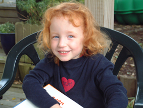 Jennifer Rogers, Age 3 |
|
© 2002 Paul Rogers, Kristie Rogers, Red Moon Design - All Rights Reserved. Any reproduction, copying, downloading, transmission or broadcast or any other use of this artwork, without the express written permission of the Rogers and Red Moon Design is strictly prohibited.
© 2002 Bob Zorich, Cher Wilson, Yescapade - All Rights Reserved. Any reproduction, copying, downloading, transmission or broadcast or any other use of this webpage and its contents, without the express written permission of Yescapade is strictly prohibited.